
I have to admit that I’m the strange visitor at historic sites. I not only take photos of the architecture and landscape, but reception desks, walkway paving, light fixtures, wheelchair ramps, and signs. These are the things that make a visitor experience good, bad, or ugly, but they’re often overlooked and it’s hard to find good examples.
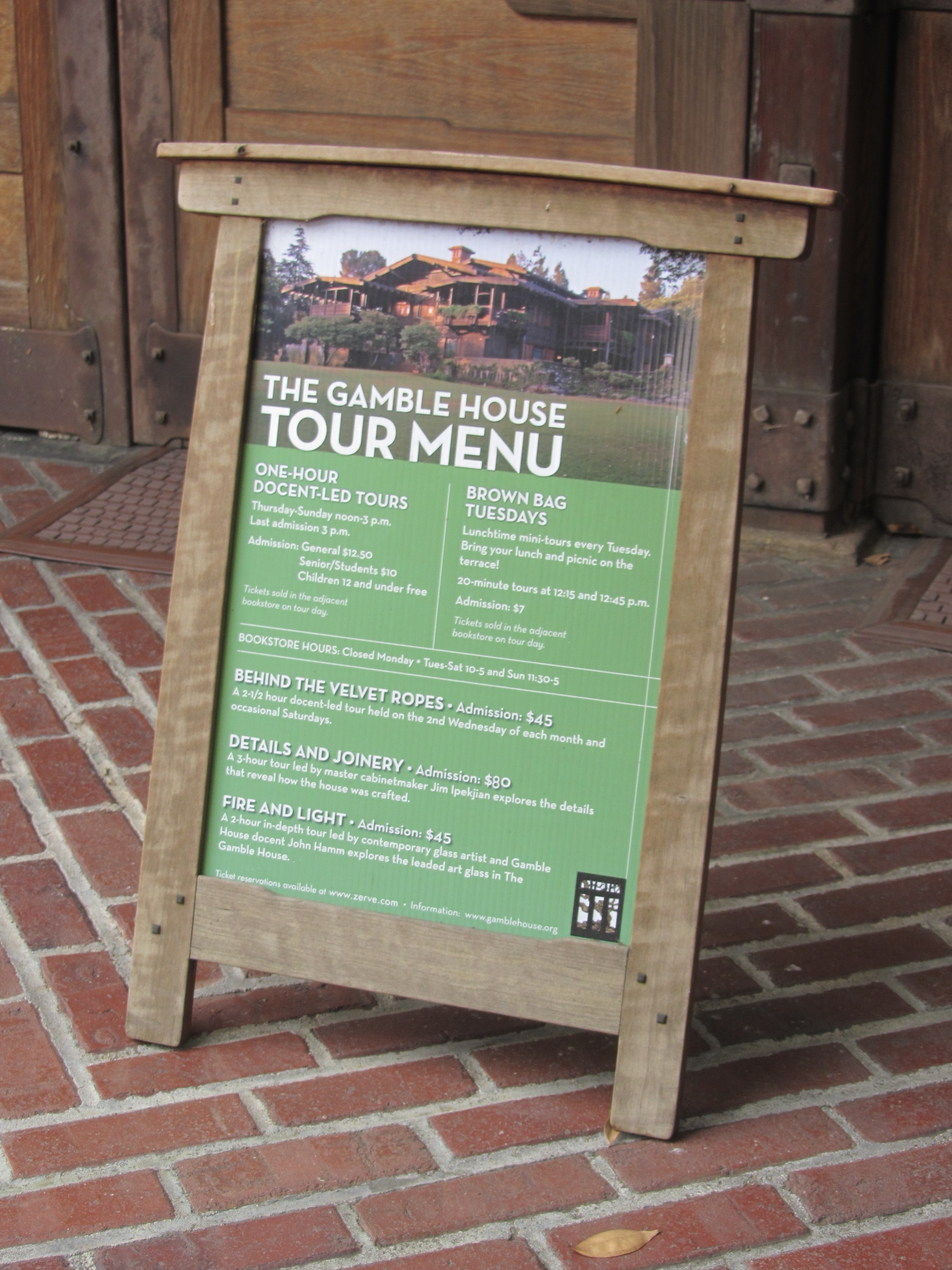
Gamble House Tour Menu Sign
Here’s one from the Gamble House in Pasadena, California. It’s a sandwich board placed on the driveway leading from the sidewalk to the garage, which now serves as the bookstore and admission desk. The sign isn’t big, but the bright color and location makes it easy to spot from the sidewalk. Visitors can comfortably learn about the options and then go inside the bookstore to buy their tickets. Notice it’s called a “tour menu,” using familiar terms so that visitors quickly grasp the purpose of the sign. The sign is placed outside in shady spot in front of the bookstore (those are the doors behind the sign). The store is small and often busy so encouraging people to make their selection outside is much more comfortable, especially because these types of decisions are typically negotiated by the entire group.
Even more clever is the design. The frame mimics the architectural style of the house (Craftsman) but the sign is modern. Sure, they could have created one in the Arts and Crafts style, but the primary intent is to convey information quickly and clearly. That means simplifying things and creating a clear hierarchy–there is only one typeface and basically two colors and three type sizes. Secondly, the design conveys the site’s sense of aesthetics (and as a Greene and Greene-designed house, aesthetics are paramount) yet that is up-to-date and modern.
Just as direct and simple is the construction. It’s a full-color sign printed on white corrugated plastic (rigid, holds up to weather, easily made by a graphic designer). The frame has a cap at the top that comes off to reveal the slot into which the plastic sign is slid into place. I suppose a different sign could be slipped in temporarily for a special event. At the back is one hinged leg so that it sits squarely on the ground with three legs but can be folded up and stored out of the way. A single handle at back allows it to be easily carried around.
Maybe the sign could be taller and the smallest type enlarged to make it easier to read, but I’d have to watch some visitors to be sure it’s worth the effort. Otherwise, this sign gets an A+ from me.

Max: Please do more of these comments. I spot these things, too, when I tour around. But I don’t spend much time thinking about them, I don’t write about them and I never take photos of them. So, I am glad that you are doing this. However, I have often felt that it is the little things – like this simple sign – that show how a site functions and if its management is asleep or clever.
LikeLike