Tag Archives: Signs

How to Encourage Good Behavior at Memorials and Historic Sites

“Visitors are invited to touch the memorial names panels.”

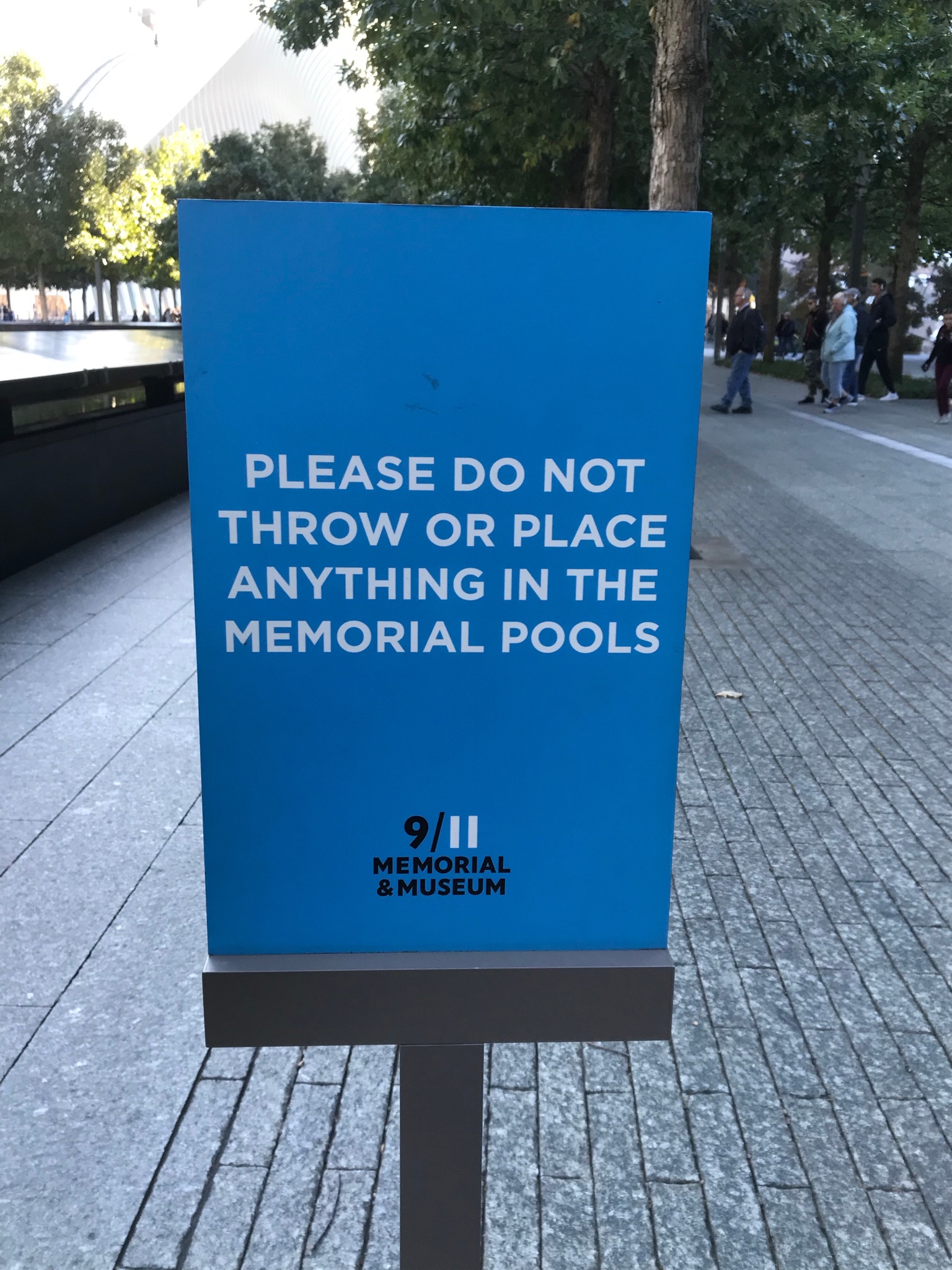
I recently visited the National September 11 Memorial and Museum in New York City and although I didn’t know anyone who died that day, I was incredibly moved by the experience, even feeling uncomfortable taking photos. But I did because I’m always trying to understand how to interpret various events and topics, especially those that are difficult or sensitive.

I was also surprised that there was a need to explain to visitors how to behave at the memorial, the huge open fountains that mark the location of the Twin Towers and record the names of those who were murdered. Some explain what you can do, others what you shouldn’t, and some explain what’s happening. These might inspire you to think about language that might be appropriate around memorials and historic sites in your community.

Campbell House using Simple and Durable Interpretive Tools

This slideshow requires JavaScript.

When I recently visited the Campbell House Museum in St. Louis, I was really impressed by their use historic images and documents throughout the tours.  It wasn’t just that they were integrating lots of different historic materials into the tours (that’s always a good practice), but they looked great.  In the entry hall, a couple 16″x20″ historic maps on the wall put the house in a historical context.  In the parlor, a stand held an assortment of historic photos on lightweight boards, which the docent passed around so that visitors could examine them more closely.

They were clearly modern so there was no confusion you were handling something historic and the docents could easily use them because they were so simple and light.  They were easy to examine because the matte surface reduced glare from the sun and lights. But what really surprised me is that they were more than ten years old—they looked brand new!  No edges were peeling and the images hadn’t been worn out or bent by the constant handling.  Even better, they were cheap to produce—about $8-10 per square foot by a local sign maker. These are so much better than laminated or framed interpretive tools I’ve seen and used elsewhere.

If you’re interested in creating these for your site: Continue reading

Gamble House’s Clever and Attractive Sandwich Board

I have to admit that I’m the strange visitor at historic sites.  I not only take photos of the architecture and landscape, but reception desks, walkway paving, light fixtures, wheelchair ramps, and signs.  These are the things that make a visitor experience good, bad, or ugly, but they’re often overlooked and it’s hard to find good examples.

Gamble House Tour Menu Sign

Gamble House Tour Menu Sign

Here’s one from the Gamble House in Pasadena, California.  It’s a sandwich board placed on the driveway leading from the sidewalk to the garage, which now serves as the bookstore and admission desk.  The sign isn’t big, but the bright color and location makes it easy to spot from the sidewalk.  Visitors can comfortably learn about the options and then go inside the bookstore to buy their tickets.  Notice it’s called a “tour menu,” using familiar terms so that visitors quickly grasp the purpose of the sign.  The sign is placed outside in shady spot in front of the bookstore (those are the doors behind the sign).  The store is small and often busy so encouraging people to make their selection outside is much more comfortable, especially because these types of decisions are typically Continue reading

Burma Shave Inspires Signs at St. Jones Reserve

This slideshow requires JavaScript.


St. Jones Reserve in Dover, Delaware is a 3,750-acre nature preserve on the edge of Delaware Bay dominated by salt marsh.  Deep inside is an environmental education, training, and research facility at the end of the long unpaved road–how do you ensure visitors that they’re on the right track and not getting lost in the countryside?

Education Coordinator Jennifer Holmes came up with a clever idea to install a series of signs along the entry road to Continue reading

Rethinking the “Do Not Touch” Sign

Museums and historic sites are well known for their “do not touch” signs.  The UK National Trust worked with The Click Design Consultants to change the rules to engage visitors. According to The Click,

The campaign, titled ‘Nature’s Playground’, is designed to entice visitors to explore, enjoy, savour and touch. A series of nine signs were created which, at first glance, look like warnings or instructions not to do something, whereas actually they encourage the opposite.

The physical signs were packaged up and sent out to National Trust properties across the east of England. The properties were then briefed to install the signs in appropriate locations within their grounds and / or estate. The inclusion of a hashtag (#NaturesPlayground), encourages visitors to Continue reading

Vinyl Banners that Look Sharp, not Saggy

The other week I passed by Anderson House and was so struck by their full-color monument signs that I had to take a closer look.  They’re the common vinyl banners that can be made by nearly every sign and banner store, but they were incredibly neat and clean–none of the usual sagging, wrinkling, and rippling.  Mounted across the top and bottom with Velcro onto a metal frame, the bottom corners of banners are also secured with bolts to keep them from flying away in the wind or easily taken by admiring thief.  The frame is made of square tubing, whose legs slide onto a corresponding set of tubes set in the ground.   Emily Schulz, the deputy director and curator, generously provided more details:

“We installed the banners on the front lawn in mid April 2012, so they’ve been up pretty much exactly one year.  They replaced a small sandwich board sign that was put out every morning and Continue reading